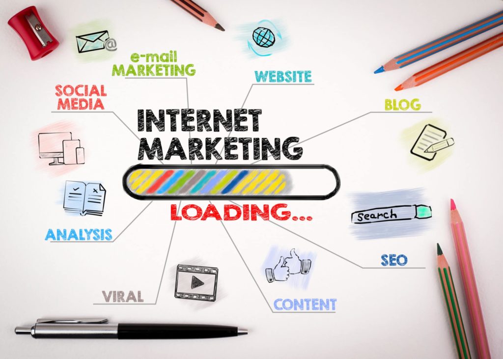
When you reach out to a business for the first time, where does the interaction occur? Personal experience probably tells you that it’s their website, and that first interaction is going to influence how likely you are to engage further. Regardless of the type of business you’re operating it’s the website that attracts leads and delivers conversions. This is especially crucial for a B2B website.
For B2B businesses, which typically have longer, more complex sales funnels, a website that’s built to meet clients at each touchpoint and move them one step closer to conversion is essential. Without an approach to website design that takes the unique nature of B2B businesses into consideration, you might get potential clients to land on your site, but you’re not going to see the results with lead generation and conversion optimization that you’re looking for.
Think about it. You’re running a business and protecting it from
hackers and cybercriminals is a major priority. You wouldn’t be interested in
connecting your business with one that didn’t have a secure website, so you
can’t really expect others to either.
Lack of security is something that often plagues smaller B2B operations. Many of them simply aren’t aware of the potential consequences of not taking those few extra steps for security. Google has made it super easy for clients to spot a site without an SSL certificate, plus having an unsecured site can tank your SEO efforts.
Responsive
Design
In the past, responsive design wasn’t a top priority for B2B websites because it was assumed that most business contacts weren’t reaching out to you through their phones. Times are changing, and an increasingly remote workforce means it’s time to shed the assumptions and invest in a responsive design website that provides a seamless experience across each and every one of their devices.
Speed
It’s not exactly breaking news that speed matters for web development, but for B2B businesses, a slow loading site can equal certain death. If the average search engine user isn’t willing to wait more than a mere few seconds to load, a client is going to lose interest even sooner. Not to mention that a slow loading site makes you look unprofessional and outdated.
Navigation
There’s a strong trend in B2B websites for clean, simple single page
web design. There isn’t anything wrong with this approach to web design, especially
since they’re easy to optimize for speed and generally function well for the
mobile consumer. The only downside is that sometimes, navigation is left in the
dust.
Just because you have a single page site doesn’t mean that navigation
is unimportant. The last thing you want to do is leave visitors scrolling to
find what they’re looking for or risk having them miss a crucial CTA. Design
your site with sticky navigation to eliminate any navigational pain points that
might stand in the way of CRO.
Connect with a Professional B2B Website Design Company
The look and functionality of your B2B website is a major component of
your success. Even details that seem relatively minor can have a significant
influence on the likelihood that a new lead will convert. At Double Up Digital,
we specialize in CRO focused web development. You can trust our web design
company with your reputation. Contact Double Up Digital today.
It’s time for a website redesign, and you’re looking to get the biggest impact from your investment. You’ve poured over the metrics and devoured everything you could on the value of user experience in website design. Still, wouldn’t it be great if you could access insights about how visitors really interact with your website and where their pain points exist? User behavior analytics is the solution you’re looking for.
There’s a ton you can learn about your website visitors with behavioral
data. These insights can help you optimize your new web design to generate more
leads and level up your conversion rate.
Here are the basics to get your started.
Why User Behavior Analytics Is Important
Retail stores use behavioral data all the time to influence their merchandising strategy. They pay attention to details like the customer’s movement through the store, where they’re most likely to stop and linger and which types of displays are most effective for encouraging last minute, add-on sales.
Using specialized tools, you can access similar types of behavioral data for your web design. For instance, you can learn where visitors are stopping to linger as they scroll through your website and you can discover which elements of your web design encourage movement and where a lack of optimized user experience is turning people off.
At the end of the day, the overall performance and usability of your
website determines how successful your business is. There just aren’t a lot of
crazy successful businesses out there with websites that fail to optimize the
user experience. Let’s look at how you can start leveraging behavioral data to
influence your website redesign.
The Basics of Behavioral Data
Behavioral data is all about digging in and getting real insights about
how users are interacting with your website. It is less about black and white
numbers and more about tangible insights that give you a peek into the minds of
your website visitors.
There are multiple tools and techniques you can use to collect
behavioral data. Two of the most popular, and most effective, methods of
collecting this data are user interviews and heat maps.
User interviews involve real people using your website and then communicating
to you details about their experience. User interviews work best when you
include people that are from the target audience you want to engage with. You
can use this opportunity to learn about where your website met their
expectations and where they encountered frustrations.
Other conversion rate optimization (CRO) tools like heat maps provide invaluable insights into how customers are engaging with your website. Heat maps provide a visual representation of the “hot” and “cold” areas of your web design. For example, if you notice that your most important CTA is in the middle of a cold zone, then this tells you that it’s crucial to rethink its placement.
Optimizing Your Website Redesign
There are a lot of components that go into successful web development.
Working with a professional website design company for your redesign gives you
a competitive advantage in the digital landscape. We’re a team of professionals
who know exactly how to produce results with your website redesign. Contact Double
Up Digital and speak with a professional web developer
today.
If you’ve been paying even a modest amount of attention to what’s happening in the world of search engine optimization, you’d have to be living under a rock to not know about the importance of mobile optimization. Still, information about whether or not mobile responsive design is one of Google’s true SEO ranking factors remains a little elusive.
The Significance of Mobile Responsive Design
You want to do everything you can to boost your visibility in search results and this means earning a favorable nod from Google in regard to your approach to search engine marketing. Today, achieving this relies heavily on your ability to attract and engage with mobile consumers. Let’s look a little deeper at mobile responsiveness and discuss whether or not it’s a real ranking factor in 2019.
What Is Mobile Responsive Design?
There are a few different terms that get thrown around when discussing mobile optimization. Mobile responsiveness tends to get thrown into the crowd, but it’s actually a bit different. While other strategies are focused simply on being accessible and appealing to the mobile consumer, mobile responsiveness includes elements that enhance mobile user experience.
When we talk about mobile web design, we’re referring to a business that has one website that responds automatically to the site visitor, regardless what type of device they’re using. Mobile responsiveness meets the usability and functionality needs of a growing majority of your site visitors.
Where Google Comes In
Last year, Google made their mobile first index official and included mobile page load speed into their algorithm. Their intention was to reward businesses with mobile optimized sites and they claimed that few businesses would actually take a significant hit.
So, we know that load speed is a ranking factor and we know that having a mobile site means that you’re going to be crawled and indexed ahead of your competitors that don’t. This is all important for search engine marketing, but it doesn’t really answer the question of whether or not mobile responsiveness is factored into the Google algorithm.
While the answer might not be clear, there are a few things we can conclude from the information that we do have.
Google Likes Responsive Web Design
Google hasn’t come right out and said responsive design is a ranking factor on its own, but they have said that they prefer responsive design over websites that have a separate designated site for both desktop and mobile users. In many ways, responsive design makes Google’s life a lot easier.
For instance, responsive websites cut down on duplication and the overall number of sites that Google has to crawl and index. The bottom line is that if Google comes right out says they prefer a certain way of doing things, your best option is to follow along with their advice.
Mobile Users Like Responsive Design
Responsive websites are built with many of the comfort and usability features that provide an optimized user experience for the mobile consumer. Elements like load speed, navigation, and page layout matter, and responsive design has no problem meeting these expectations.
Plus, responsive design provides a seamless experience for consumers who are visiting your site through different types of devices. This increases the number of repeat visits they make and how much time they spend on your website – two elements that do matter for SEM.
Responsive Design Experts
If you want to learn more about mobile responsiveness and how it can enhance your search engine marketing, we’re here to help. At Double Up Digital, we offer professional SEO services, including web design that will boost your conversions. Connect with Double Up Digital today to learn more.
As a small business, your website is the most critical vehicle you have for attracting customers and moving them through your sales funnel. Awell-built site performs many functions, each being vitally important to your success, however, simple web design mistakes might be curbing your success.
5 Common Web Design Mistakes
It often happens that small businesses approach web design with limited experience and as a result aren’t always aware of how they could potentially be hurting their revenue stream rather than building it. If your website isn’t performing up to your expectations, take a look to see if you might be making one of these five common web design mistakes.
Confusing Design
There’s nothing worse for your website visitors than to land on your site and have no idea of what they should do next. This doesn’t mean that you should have big, blinking arrows leading the way but your website design should be intuitive to the user. Often, small businesses will attempt to do too much with their website and as a result, leave their visitors overwhelmed and confused.
For instance, does your web design feature simplified navigation, content architecture that makes sense and a call to action that stands out and is relevant to the page it’s on?
Not Investing In Responsive Design
Your audience is visiting your site from multiple types of devices, including smartphones, tablets, and laptops. It’s essential that small businesses provide a seamless experience for their users regardless of the device they’re using. This is especially important since many first visits happen on mobile devices, but conversions occur more frequently from tablets and personal computers.
Responsive design allows you to provide a cohesive user experience across all devices. This not only instills trust, but it also helps your visitors form a stronger connection with your brand.
Meaningless Content
Content shouldn’t be used as a space filler. What we mean by this is that content needs to be high quality, purposeful and relevant. If content, no matter what form it’s in, provides no value to your audience, then it has no business on your website.
Along with this, be careful about where you place content. There’s nothing wrong with having a business bio, but that’s probably not the first thing someone wants to see when they land on your homepage. Think about content architecture and how to use it to move visitors through your website.
No Credibility
Today’s consumer wants to see social proof that you’re as good as you say you are. They could go off and check on social media or any of the number of business review platforms, but why make them do the work. Include credibility elements in the form of reviews, testimonies, and credibility badges that highlight your expertise.
Lack of SEO
Your website should be command central for SEO, and it’s crucial to maximize your efforts as much as possible. These efforts include a site architecture that’s optimized for search engines but also other elements like high-quality content and a strategy for on-page local SEO.
Leave Web Design Mistakes in the Past
If you’re a small business that would like to see more performance out of your website, we are the web design company full of experts that can help. Contact us today to speak to one of our experienced web designers about how you can avoid the common website mistakes that cost your business money.
As we’re making our way through the early weeks of 2019, we can’t help but stop and think about what the coming year will bring for digital marketing. Last year brought about noticeable changes in how consumers engage with businesses online and what elements of their user experience (UX) mattered most in forming relationships.
The Significance of User Experience
As many businesses are approaching the new year with a renewed perspective and a fresh approach to SEO, it’s important to look at one of the most crucial components of SEM – the user experience. Is UX still vital to SEO and why is key for digital success in 2019?
The Google Factor
Search engine optimization has changed drastically over the years. Back in the early days of SEO, the focus was entirely on getting a search engine’s attention and nothing else. This tactic lead to some practices that weren’t only on the wrong side of being shady but also detracted from the overall quality of the user experience. It didn’t take long for search engines to catch on to their user’s discontent.
Fast forward to 2019, and search engines put a lot more weight on your ability to provide quality and value to their users than they do about your ability to stuff a bunch of keywords into a piece of content. In fact, while Google remains fairly elusive about their algorithm, many of the most important ranking factors that we do know about are focused on UX in one way or another.
For example, Google pays attention to metrics like your speed, bounce rates and how long visitors are lingering on your site. Details like these paint the story of how well you’re meeting your visitor’s UX expectations.
Search Engines Are Becoming Smarter
The time-honored elements of effective SEM aren’t going anywhere. Keyword optimization, backlinks and website architecture are still critical for SEO, but search engines have become significantly more sophisticated in recent years, and it’s no longer necessary to always spell things out for them.
What this means is that while you need some of the basics of SEO for search engines to find and crawl your site, they’ve also become more sensitive to intent and relevancy and can pick up on them through minor cues. This update allows businesses to focus more on providing an optimized UX for their website visitors rather than worrying about appealing to search engines. Essentially, if you’ve created a website and content that your audience reacts positively to, this is going to be looked upon very favorably in the eyes of search engines.
UX Helps You Stand Out
Let’s face it; the digital landscape is becoming more crowded by the second. This growth translates to a ton of competition that you need to elbow your way through to make it to the top of search results. With so many businesses taking the same standard approach to SEO, it’s going to be an optimized UX that helps you stand out.
UX Design Experts
Would you like to know more about how to provide an exceptional UX for your audience? At Double Up Digital, we offer the SEO services that will expand your brand’s presence online and earn you a reputation of excellence. Contact us today to learn more.
Ask any web design agency or marketer about the secrets to building a following and generating conversions, and you’ll likely get an answer that has something to do with emotions. Humans are emotionally driven and appealing to various emotions is key to moving consumers through your sales funnel.
There are plenty of ways to engage emotions, some obvious and others not so much. For instance, a content strategy that appeals to emotions is an obvious strategy. When it comes to the subtler emotional elements, color is one of the most important.
There have been significant studies concerning the psychology of color and how to leverage color from a branding and marketing standpoint. The colors that are used throughout your website design are essential for every step of the customer journey – from first impression and lead generation to the final stages into conversion.
Color Psychology
We live in a world that’s filled with color, and the colors that we come in contact with can have a major impact on how we experience our surroundings. Take for example how a person’s mood can be supercharged on a sunny day, but take a nosedive after a few days of cloudy, gray weather. In business, the ability to understand the psychology of color and how it affects the emotional connection customers have with your brand is a very powerful tool.
Color psychology is basically the study of human behaviors in relation to different colors and hues. It’s the study of how we react physically and respond emotionally to color, as well as how it influences our decisions – like whether or not to purchase a product or invest in a brand.
How Color and Web Design Lead to Conversions
Your website is one of your strongest assets for supporting the customer journey. Anything that can be done with web design to encourage conversions is a plus. Using the right color, at the right time can help this happen.
This starts by considering the power of color when creating your brand image. For example, red is associated with excitement, confidence and vitality. Brands like Target and Coca-Cola have had great success with this color. On the other hand, blue is the color of trust – which is probably why IBM, PayPal and Facebook choose it as their primary branding color.
What type of emotion are you looking to spark with your customers? How do you want them to feel about your brand? Your brand’s colors are going to be infused throughout your website, so answering these questions as early on as possible is key to success.
Next, conversion success with color is about knowing when and where to use it. A children’s birthday party planner is going to want to use a bright, colorful theme to encourage interest and eventually conversions. The same color scheme would likely fail for a high end cosmetic company whose core audience is looking for colors that represent luxury and sophistication.
Finally, think about where to use color in your web development. For instance, red is a high performing color for CTAs, especially for urgent or impulse driven purchases. But black can be equally conversion worthy if used in the right setting, especially when targeting an audience that’s primarily male.
Work with an Experienced Web Design Agency
Would you like to know more about how the right use of color can increase your conversions? Our web developers are experts in color optimization. Contact Double Up Digital and speak with a website design company that knows exactly how to create a beautiful web design that delivers your brand and generates conversions.
Of all the efforts you put into building a presence online, it’s your web design that’s at the heart of your success. It’s the place where people get to know your business, and it’s the place where visitors become customers – at least this is the way it should be. If your website design isn’t delivering your brand, providing the ultimate in user experience and converting in the process, then it isn’t doing everything it’s capable of.
Web Design Tips For More Conversions
Fortunately, you can improve your site’s ability to convert by taking a few simple steps to improve its overall design and function. Here are 7 web design tips that will work fast to boost conversions.
Simplicity with Hick’s Law
Hick’s Law is a theory that states the amount of time it takes a person to decide is directly proportional to the number of choices they have. To use Hick’s Law to your advantage, keep simplicity a primary theme in your web development. Keep navigation simple, and break product menus into manageable chunks rather than endless lists of options. Giving the visitor too many options gives them time to reconsider their purchase altogether.
Go for Speed
When it comes to how fast your website loads, time isn’t on your side. The average visitor starts to lose patience after 2-3 seconds – basically the blink of an eye. If they lose interest before even entering your site because it’s slow to load, you’ve basically lost any chance of conversion. Making speed a priority is an easy way to boost your success.
Use Negative Space to Your Advantage
Negative space, which is all that beautiful blank space that helps the eye flow smoothly through your web pages, isn’t a negative at all. While the whole point of negative space is to have “room to breathe,” you can use this space to your advantage by placing an eye-catching, singular element – like a CTA in this space to grab even more attention.
Add Video
Well placed quality video is one of the most conversion worthy elements your site can have. Take for example, that using video on a landing page can increase conversion by 80%. Still, landing pages aren’t the only place video packs a punch. Try using full page video on your home page or including an explainer video on product pages.
Build in Your Brand
It’s important to use your branding, including your colors and logo, throughout your website. If you’re known for bold colors or design, this can be difficult to do while not visually overwhelming the visitor. Don’t worry, you can still work it in and have a site that encourages conversions.
Start by choosing prominent elements of your brand to weave through the site and then maintain consistency. For instance, select the strongest color in your branding and work it into every page. Use secondary colors for CTAs and other elements that need a punch of color to grab attention.
Use Quality Imagery
A picture is worth a thousand words, and a bad image can speak volumes and turn prospective conversions away. If you’ve been relying on low-quality stock imagery to boost the visual appeal of your site, this could be one of the reasons conversions are turning away. Invest in quality images and video, or if you must use stock photos, use ones that look professional, modern and match your brand image.
Contact a Professional Web Designer
Building a site that serves as a conversion magnet can be tough. Sometimes the most effective way of boosting conversions is putting your trust in a website design company that knows how to get the results you want. We’re the web design company you’re looking for. Contact Double Up Digital today to learn more about our team of web developers and professional design services.
If you want the boost in visibility and all the other perks that effective search engine optimization provides, starting with a clear picture of what motivates your audience is key. Much time can be spent learning about market segmentation and consumer behaviors, but there’s one area where you don’t need to dig too hard for the answers – speed. Continue reading to learn how website speed directly impacts your SEO campaign.
SEO Statistics
Statistics tell us that website visitors are craving instant gratification more than ever before. As the number of people connecting to the internet via mobile has risen, so has their intolerance for slow loading sites. Earlier in 2018, Google released benchmarks which showed the average load time for a mobile landing page was 15 seconds, yet 53% of site visitors will leave if it takes more than 3 seconds for content to load.
That equals one massive discrepancy in what site visitors want compared to what they’re getting. But, is site speed so vital that it can cause your SEO to take a hit? Here’s what you need to know.
Website Speed and Google’s Algorithm
Google uses an algorithm that contains at least 200 distinct ranking factors that determine the quality and relevancy of your website. While Google hasn’t always been forthcoming about what these ranking factors are, or which ones are the most important, they’ve made a pretty clear statement that web design focused on speed is a critical component.
The search engine has long said that speed was necessary for desktop sites, but as of last summer, Google also made it official that mobile site speed is an essential component of SEO and SEM.
The logic behind this is simple. Mobile usage is climbing, but businesses across the board are coming short in meeting the demands of the mobile consumer. To remedy this and improve overall user experience, Google decided to reward fast loading mobile website design with a nice little boost in rank.
Speed, User Experience and SEO
You and Google, or any other search engine for that matter, have something in common. You both want to provide the best possible user experience. Because of this, user experience (UX) and SEO are intertwined in many ways. For instance, the quality of UX can determine how long a visitor lingers on your site – a metric that search engines are known to pay attention to.
Site speed also plays into how successful your approach to search engine optimization is in other ways. A business that has put effort into local SEO is hoping to attract a local audience that likely has a high number of mobile consumers. If site speed is low, it’s an automatic negative first impression, and you can expect to see lead generation and conversion rates tank as a result.
Remedying the Speed Issue
Slow loading sites that lag behind the modern consumer’s expectations will hurt your SEO and also put a sizable ding in the level of trust and respect that surrounds your brand. So how do you improve your website speed?
There are multiple ways to test and enhance the speed of your web design, and it all starts with professional web development by a team that also understands SEO.
Web Design & SEO Experts
As a website design company that also offers a full range of SEO services, we know how to approach building up digital presence from multiple angles. If speed is a concern, contact Double Up Digital and speak to one of our professional web developers today.
Every aspect of your digital marketing strategy is designed with one purpose in mind – to lead the consumer along the path of conversion. Yet, only 22% of businesses are satisfied with their conversion rates. Unless you’re a member of that small minority, you need a plan for encouraging visitors across the finish line, and it all starts with keeping them on your site just a little longer. Fortunately, there are ways to turn your web traffic into conversions. Take a look at five strategies that perform for encouraging longer visits and support the visitor on their journey to conversion..
How To Keep Web Traffic on Your Site Longer
Attract the Right Web Traffic
First things first, if you want visitors to stay around long enough to convert, you need to make sure you’re attracting the right audience from the start. If you’ve been throwing every single hat into the ring of your marketing strategy and hoping that something works, you’re taking the wrong approach.
Step back and target your digital marketing attempts. Using analytics, uncover the segment of your audience that’s most likely to convert and learn how to reach out to them through strategic content and keyword usage, social media outreach, pay per click ads and other digital marketing tactics. Properly understanding your web traffic is critical to conversions.
Improve Your Content Strategy
Once someone has landed on your site, you need to give them a reason to hang around. Quality content that’s relevant to your brand and the consumer’s needs can easily accomplish this goal. We’re not just talking about updating your business blog weekly, although that can be part of a successful content strategy.
You should also consider how content fits into your overall website design. Have you made it so that quality content stands out and is easy to find? Does the static content on your homepage encourage someone to want to read more? Have you tapped into the engagement that video brings? Look at your content strategy and discover how to elevate it.
Optimize Navigation & Speed
Today’s consumer has absolutely zero patience for sites that are slow to load or difficult to navigate. It’s crucial that your web development include strategies that allow your site to load instantly and translate seamlessly across multiple devices – such as responsive design.
Plus, there are just too many sites out there to justify wasting time on one that makes it near impossible to find what you’re looking for. Keep navigation streamlined to avoid roadblocks that encourage exits.
Update Your Appearance
It’s difficult to be completely unbiased when looking at your own web design, but if your site is too cluttered, too visually stimulating or looks like it stepped right out of 2001, then you’re going to accomplish the exact opposite of meeting your lead generation goals. You have to consider your website design and how it is affecting user experience.
Keep your site design clean, with plenty of white space that allows the visitor’s eyes to rest and easily find their way around your pages. Keep the purpose of each page clear and stay true to a common theme throughout to provide the most intuitive and cohesive experience.
Stay Current
Finally, even if you think things are going along swimmingly, don’t neglect to update your website and keep current with changes in technology. Whether it’s responsive design or simply updating the colors to match your existing branding, it’s always apparent when upkeep has been put on the back burner, and it’s a significant deterrent for your visitors.
Would you like to learn more about keeping visitors on your site longer? We’re the website design company that can help. Contact us today and let one of our web designers show you how the right approach to design can help you meet your goals with a free user experience audit.
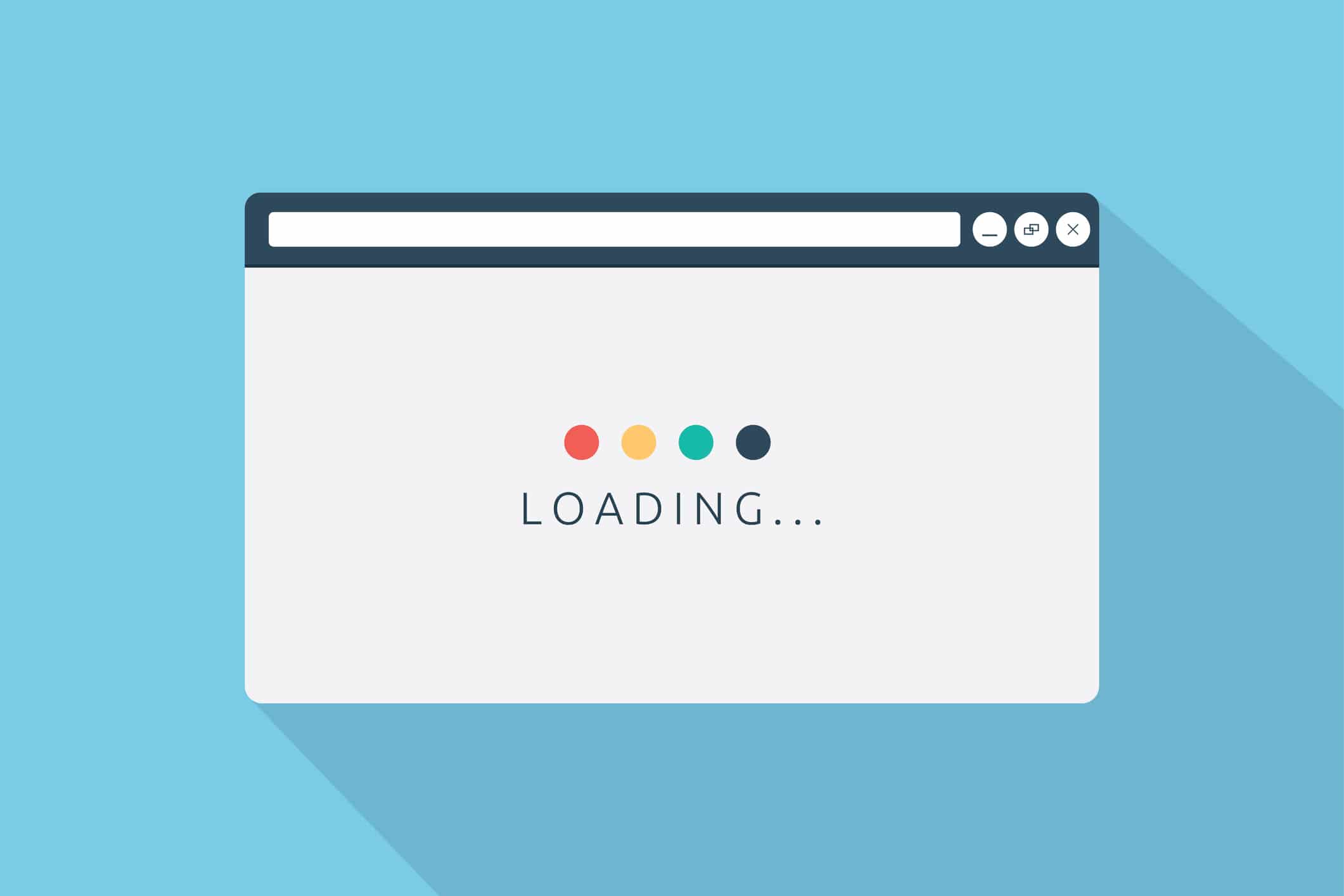
Animating your icons can keep the user engaged on your page and add to the value of the icon, allowing for more creativity to be displayed in a way that’s simple and fun. Adding multi-step CSS animations to SVG’s is easier than you think!
Let’s take a look at the example below. Seems pretty familiar right? While waiting for that next text to come in, you’re watching an animation.
This is a simple CSS animation to complete because there are only three parts to focus on. The more pieces there in your SVG, the more complex the animations will become and the more moving pieces there will be to consider. You may even have to involve some *gasp* math.
Creating these CSS animations usually involves a few more steps than people understand — all beginning with the SVG.
Getting started
For today’s example, I’ll be using our social media icon from the homepage. It best displays fluid multi-step CSS animations appearing to be in one animation together. Sure, you can copy the code below, but what fun would that be?
An SVG or scalable vector graphic allow pieces of an icon to be targeted through css for animation. The first step of created your new animated icon is designing it using Illustrator or another graphic design program than can export vector art as an SVG.
It is very important to make sure your layers are properly sectioned off and labeled with an intuitive name. Trust me, you don’t want to name everything thing1, thing2, thing3, because these names will become the ID tag of the piece in the SVG. Animating parts in an organized way will make it easier for you in the end. The more layers and groups you create, the easier it will be to animate through CSS.
The next step is to export the artwork as an SVG and copy the code that is outputted. This can usually be done my clicking the “Show Code” option just before saving the SVG. The code it will spit out may look like the stuff of nightmares, but it’s actually all the little pieces of your icon broken down into coordinates and colors. Shapes are defined as familiar objects, such as lines and rectangles, and layers and grouped objects are labeled with <g> tags.
Take this code and place it in your favorite code editor and organize it to your liking. Try to make sure all the groups, labeled with <g> tags are separated and together. This is more about me wanting organization, so you don’t have to follow it if you don’t want to — I’ll never know.
Separate out the inline CSS and place it into it’s own style sheet or SASS file. Now, we can start the magic!
Calling the animations
First, you need to call the animation and set its parameters. Target the element and define the animation. See below for an example.
W3Schools has some great explanations of all the options you can place in the animation’s properties.
Creating the animations
Now, we make the CSS animation. This is all done through keyframes, so a different step should be happening at different percentages of the animation. Since the animation we’re making here is 3 seconds, calling an animation to happen at 33 percent will calculate to one second in animation time. The more complex you want you animation to be, the more steps and percentages you will have to call.
Working with percentages in loops
Because you can only target one element at a time when calling an animation, all animations must be fired off at the same time and be the same length. Working around with the percentages is where the smoothness and fluidity of the animation come into play.
When looking at our social media animation, we can see that the dots are all doing the same animation, so why not write one and have them all start at different times through the animation delay property. This way, you don’t ever have to think about all of those percentages. This is an option, but means you will run into issues if your animation is looping.
If you were to set off every animation at a different, delayed time, then the animations would loop at different points. You would see the first dot begin to animate again while the last few are still in the middle of their own. To ensure that all animations are completed in the right amount of time and with the correct spacing in between them, you’ll have to time out the animations through their percentages.
Having one element animate from 0 percent to 10 percent and another from 10 percent to 20 percent and so on until 100 percent means they will all move and seem as though they are part of the same animation. I’m more of a visual learner, so I’m showing some of code from the loading symbol example below to further explain.
@keyframes load {

    0% {transform: scale(1);opacity: 0.8;transform-origin: center left;}
    25% {transform: scale(1.1);opacity: 1;transform-origin: center left;}
    50% {transform: scale(1);opacity: 0.8;transform-origin: center left;}
    100% {transform: scale(1);opacity: 0.8;transform-origin: center left;}

}

@keyframes load2 {

    0% {transform: scale(1);opacity: 0.8;transform-origin: center center;}
    25% {transform: scale(1);opacity: 0.8;transform-origin: center center;}
    50% {transform: scale(1.1);opacity: 1;transform-origin: center center;}
    75% {transform: scale(1);opacity: 0.8;transform-origin: center center;}
    100% {transform: scale(1);opacity: 0.8;transform-origin: center center;}

}

@keyframes load3 {

    0% {transform: scale(1);opacity: 0.8;transform-origin: center right;}
    50% {transform: scale(1);opacity: 0.8;transform-origin: center right;}
    75% {transform: scale(1.1);opacity: 1;transform-origin: center right;}
    100% {transform: scale(1);opacity: 0.8;transform-origin: center right;}

}
Notice how the first dot animates from 0 to 25 percent, the second from 25 percent to 50 percent and the third from 50 percent to 75 percent. The will sit still until their animation time and if all the animations are set to the same timing, they will look like they are part of the same animation.
From zero to 100
It really all boils down to understanding how many CSS animations need to happen and then spacing those out between 0 and 100. If there are 10 animations and you want everything evenly spaced out, something needs to be happening every 10 percent of a keyframe. Let’s start with getting the dots to scale and return to normal in order. Each dot growing and shrinking is two keyframe events. There are 11 dots, so 22 animations to consider. I want them to move fast, so I’m setting them to each be 3.33 percent of the 3-second animation. This way, the growing and returning to normal will take up 6.66 percent of the animation’s time.
It’s important to remember that you don’t want the next animation to start until the one before it is done, so the animation must not start until it’s time. This means setting the animation to do nothing until that time. Simply placing a 0 percent setting and the next animation percentage will cause the animation to start right away, but go at a slower pace. To have each animation take the same amount of time, you must have it start and stop at the right moments. This is why in the example above, the animation begins at 3.33 percent and continue until 9.99 percent before stopping. Adding the 0 and 100 percent definitions will make the animation sit still until its time to go.
We will continue adding in the CSS animations this way, each one starting 3.33 percent later than the one before it.
And last, but not least, let’s add the like and bring it all together.
All in all, it’s a fun animation that will draw attention and keep the user engaged on your page. CSS animations can be a challenge to figure out, but the end result is like performing magic.